
In today’s digital landscape, mobile-first design has become a necessity. With the increasing reliance on smartphones and tablets to access websites, businesses must ensure their online presence is optimized for mobile devices.
Responsive web design (RWD) is the approach that makes this possible, providing a seamless and user-friendly experience across a wide range of devices, from smartphones to desktops. Here are some best practices for designing responsive websites that cater to users on any screen size.
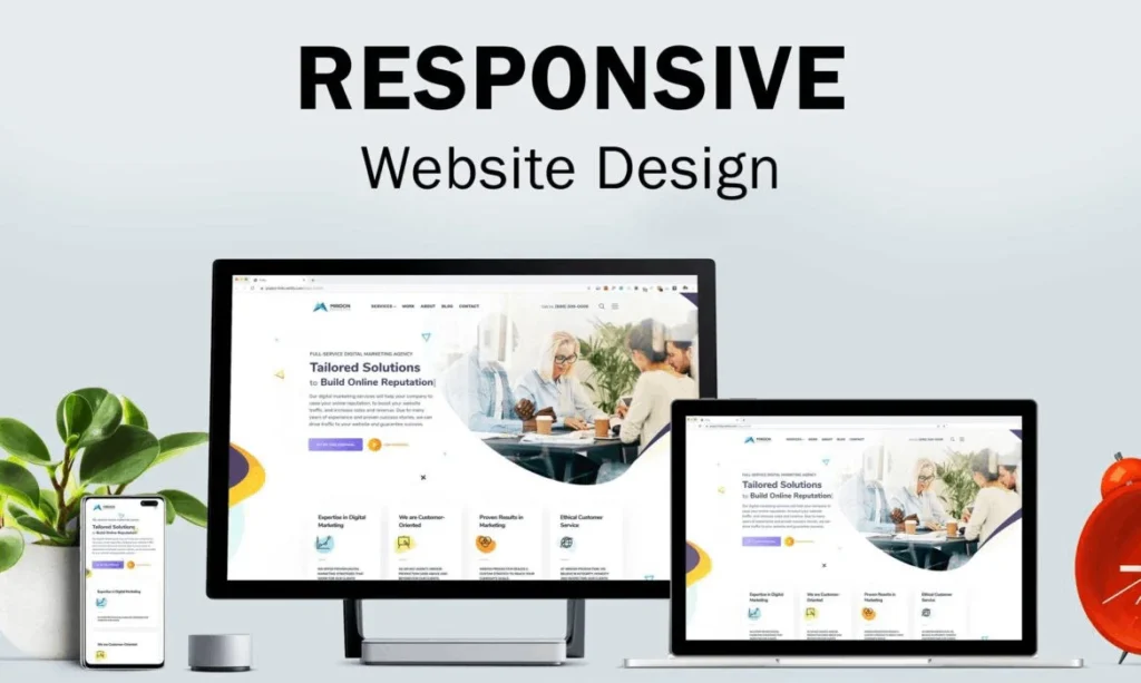
What is Responsive Web Design?
Responsive web design is an approach that ensures a website adapts to the screen size and resolution of any device, whether it’s a mobile phone, tablet, laptop, or desktop. The layout, content, and images automatically adjust based on the device’s screen size, offering an optimal viewing experience without the need for multiple versions of the website.
Why is Responsive Web Design Important?
- Increased Mobile Traffic: With mobile internet usage surpassing desktop usage, responsive design ensures your website is accessible to a wider audience, improving visibility and engagement.
- Improved User Experience (UX): A responsive website provides a consistent and smooth experience across devices. Users can easily navigate, read content, and interact with the site, whether they are on a small phone screen or a large desktop.
- SEO Benefits: Google prioritizes mobile-friendly websites in its search rankings. A responsive design helps improve SEO by ensuring that your site is optimized for both mobile and desktop search results, which can boost traffic and visibility.
- Cost and Time Efficiency: Instead of creating separate versions of a website for desktop and mobile users, responsive web design eliminates the need for multiple sites, reducing development costs and maintenance efforts.