Logo vs. Brand: What’s the Difference?
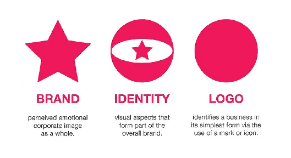
Many people think a logo and a brand are the same — but they are very different. What Is a […]

Many people think a logo and a brand are the same — but they are very different. What Is a […]
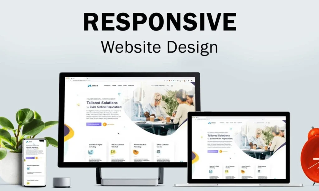
In today’s digital landscape, mobile-first design has become a necessity. With the increasing reliance on smartphones and tablets to access